GLANSIS website redesign
Restructuring and refreshing GLANSIS to fulfill its purpose of aiding early detection, response, management, and education for invasive species in the Great Lakes.
Overview
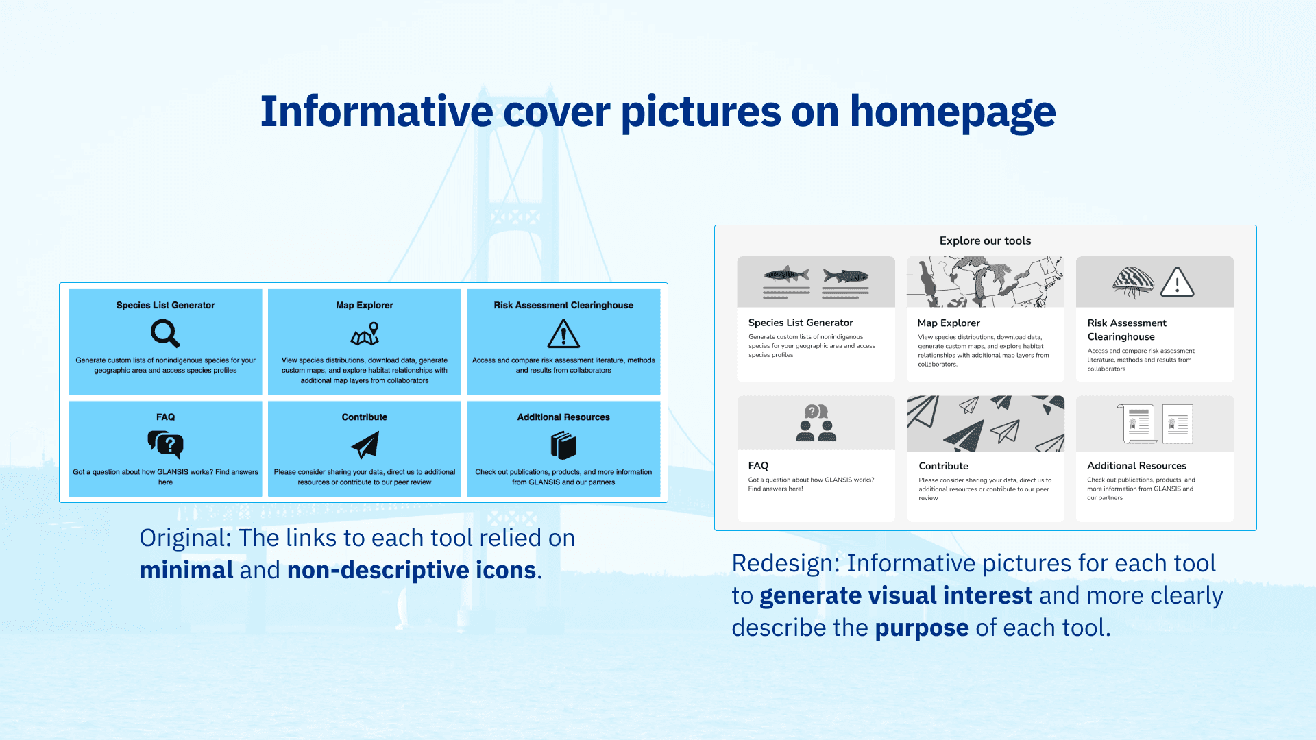
For my Intro to UX class, I took client information and desk research to redesign the existing GLANSIS (Great Lakes Aquatic Nonindigenous Species Information System) website. The current website is considered too outdated and complex to be taken advantage of valuably for the audiences that it serves. Using interactive prototyping in Figma, I refreshed the look of the website and intentionally redesigned the Homepage and Species List Generator to make it more friendly to its audiences—students, educators, researchers, natural resource managers, and federal decision-maker.
The Problem
How can we update the GLANSIS website to clearly show what tools and resources it has to offer?
The Great Lakes, the world’s largest freshwater system and home to 139 native species, faces a global threat to biodiversity—invasive species. Over 25 years, invasive species in the region have surged from 139 to 187 (MSU), with 41% causing significant harm. These invaders harm our ecosystems, economy, and society.
The GLANSIS website aids early detection, response, management, and education for invasive species in the Great Lakes, but users struggle with it due to its outdated, complex design.
The Redesign
I made the following design choices to improve the user's experience when navigating through the Species List Generator:


