Disability disclosures for ridesharing app drivers

Research Study at the University of Michigan School of Information.

role

UX Designer, Researcher

role

UX Designer, Researcher

duration

6 months

duration

6 months

duration

6 months

type

Research study

type

Research study

type

Research study

tools/skills

Figma, Illustrator, Procreate

tools/skills

Figma, Illustrator, Procreate

tools/skills

Figma, Illustrator, Procreate

overview 📄

Over the course of two summers, I worked with Professor Tawanna Dillahunt and Computing Innovation Fellow Shruti Sannon to create a storyboard that would test the effect of varying disability disclosures by ridesharing app drivers on the rider's perception of them. Through extensive research such as literature review, research on existing disability features, experiences, and symbols, I iteratively designed interfaces and a storyboard that would effectively assess the effect of disclosures with participants.

the problem 🤔

Disabled workers for on-demand work apps (i.e. ridesharing, freelancing) find it difficult to deal with customer’s expectations, and even more so when their disability can prevent them from meeting those expectations. With this challenge also comes the burdening concern of whether to disclose their disability or not.

What are ways that disabled workers on these apps can disclose their needs and constraints without necessarily naming their disability?

study summary 📝

The study tests the effect of a varying methods of disclosure from a disabled driver to a rider on a ridesharing app (i.e. Uber, Lyft) on the following factors:
Perception of the driver
Rating
Tip amount

4 types of messages to the rider are tested:
Disability disclosure
Disability-based need
Disability disclosure with disability-based need
Generic message

With Professor Tawanna Dillahunt and Computing Innovation Fellow Shruti Sannon at the University of Michigan School of Information, my primary role in this study was designing the disclosure messages and a storyboard that effectively tests the impact of the different disclosures on these factors.

research 📚

Wanting to learn about the scenery of gig work, I posed two main questions to direct my research and used the following methods to answer them:

competitive analysis

What current systems for disability disclosure in gig work exist?

I looked at existing disability disclosure methods on Lyft, Uber, and Upwork to see how people themselves, or the systems they worked on, disclosed their disability to the customer.

I also searched for profiles where people described their preferences whether they were disabled or not—this could inform how disabled drivers could state their needs/constraints without disclosing their disability.

secondary research (literature review)

What are the experiences of disabled drivers with these existing disclosure systems?

I looked at several past studies to learn more about the relationship that disabled drivers have with disclosure in their work. While features for deaf or hard-of-hearing drivers exist on Uber and Lyft, these drivers still face a strained relationship with disability disclosure that causes them additional stress and labor.

brainstorming 💭

Now that I was more familiar with the range of disability disclosures there could be, and the various experiences of disabled drivers, it was time to brainstorm the messages we would test. Exploring both system-driven and driver-written messages, we came up with several variations across disclosure and preference statements.

We had two paths we could take: designing an interface with drivers, or creating an online experiment to test the effect of these different messages on the customer's perception of the driver.

I first brainstormed some interfaces, such as a pop-up mechanism rather than the existing text message design—while doing this, I sketched a rough storyboard from a customer’s point of view to visualize where this interface could fit in the ride booking process.

Seeing how the rough sketch was able to convey the experience of a rider receiving a driver disclosure, we realized we could use the storyboard as a tool to run the online experiment of testing how the participant would perceive the driver’s disclosure after being given the situation.

Seeing how the rough sketch was able to convey the experience of a rider receiving a driver disclosure, we realized we could use the storyboard as a tool to run the online experiment of testing how the participant would perceive the driver’s disclosure after being given the situation.

Seeing how the rough sketch was able to convey the experience of a rider receiving a driver disclosure, we realized we could use the storyboard as a tool to run the online experiment of testing how the participant would perceive the driver’s disclosure after being given the situation.

designing the storyboard ✏️

symbol design

Seeing how the rough sketch was able to convey the experience of a rider receiving a driver disclosure, we realized we could use the storyboard as a tool to run the online experiment of testing how the participant would perceive the driver’s disclosure after being given the situation.

Seeing how the rough sketch was able to convey the experience of a rider receiving a driver disclosure, we realized we could use the storyboard as a tool to run the online experiment of testing how the participant would perceive the driver’s disclosure after being given the situation.

Seeing how the rough sketch was able to convey the experience of a rider receiving a driver disclosure, we realized we could use the storyboard as a tool to run the online experiment of testing how the participant would perceive the driver’s disclosure after being given the situation.

Seeing how the rough sketch was able to convey the experience of a rider receiving a driver disclosure, we realized we could use the storyboard as a tool to run the online experiment of testing how the participant would perceive the driver’s disclosure after being given the situation.

Seeing how the rough sketch was able to convey the experience of a rider receiving a driver disclosure, we realized we could use the storyboard as a tool to run the online experiment of testing how the participant would perceive the driver’s disclosure after being given the situation.

Seeing how the rough sketch was able to convey the experience of a rider receiving a driver disclosure, we realized we could use the storyboard as a tool to run the online experiment of testing how the participant would perceive the driver’s disclosure after being given the situation.

The final symbols are shown above—I tested the brainstormed symbols with colleagues and acquaintances without contextual text to see which ones were more easily recognizable.

The final symbols are shown above—I tested the brainstormed symbols with colleagues and acquaintances without contextual text to see which ones were more easily recognizable.

The final symbols are shown above—I tested the brainstormed symbols with colleagues and acquaintances without contextual text to see which ones were more easily recognizable.

experimental design

Scenario change: As shown in the initial storyboard sketch, the rider books a ride after leaving a friend's house with some other friends. However, that situation wouldn't require the driver getting out of their car. Therefore, we switched to a more applicable scenario in which the rider might expect assistance with their luggage at the airport—getting a ride from the airport after their flight.

Scenario change: As shown in the initial storyboard sketch, the rider books a ride after leaving a friend's house with some other friends. However, that situation wouldn't require the driver getting out of their car. Therefore, we switched to a more applicable scenario in which the rider might expect assistance with their luggage at the airport—getting a ride from the airport after their flight.

Scenario change: As shown in the initial storyboard sketch, the rider books a ride after leaving a friend's house with some other friends. However, that situation wouldn't require the driver getting out of their car. Therefore, we switched to a more applicable scenario in which the rider might expect assistance with their luggage at the airport—getting a ride from the airport after their flight.

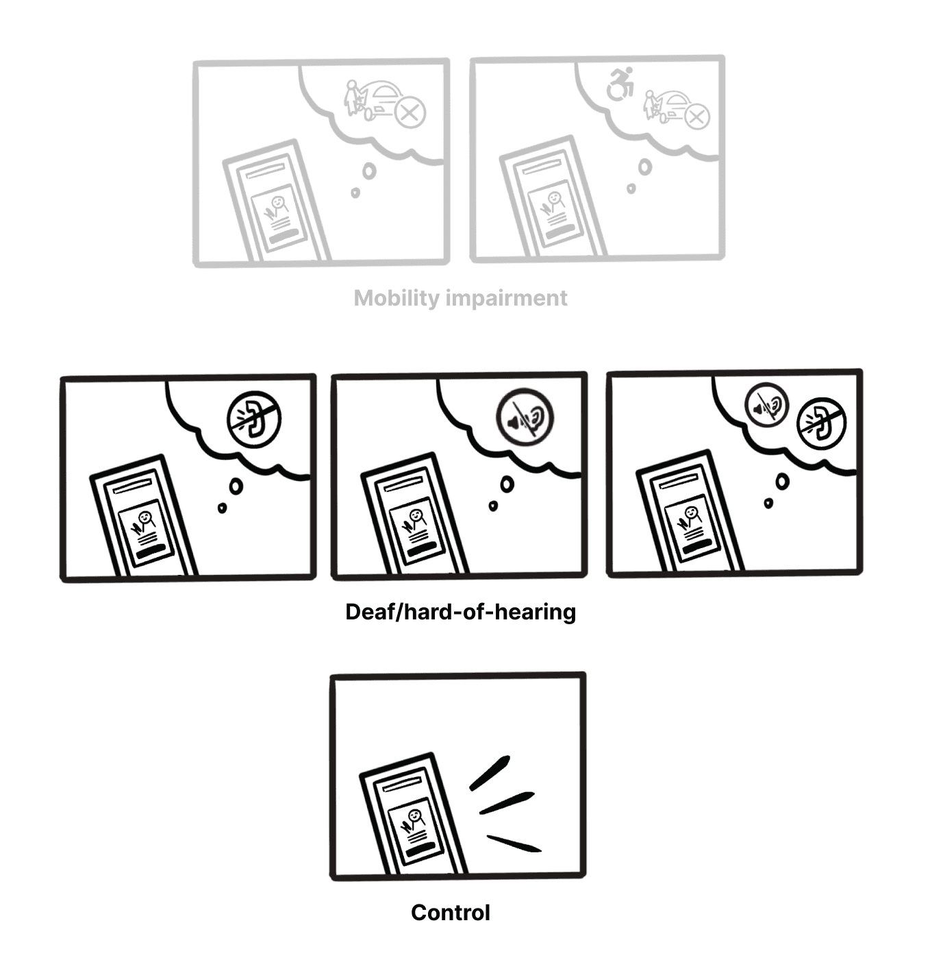
Removal of mobility impairment condition: We were trying to test the overall effect of a disability disclosure on the rider's perception of the driver, rather than how the effects different types of disability disclosures differed from each other. While it would be interesting to look at the effects of different disabilities, just testing the deaf/hard-of-hearing conditions was enough for the moment.

Removal of mobility impairment condition: We were trying to test the overall effect of a disability disclosure on the rider's perception of the driver, rather than how the effects different types of disability disclosures differed from each other. While it would be interesting to look at the effects of different disabilities, just testing the deaf/hard-of-hearing conditions was enough for the moment.

Removal of mobility impairment condition: We were trying to test the overall effect of a disability disclosure on the rider's perception of the driver, rather than how the effects different types of disability disclosures differed from each other. While it would be interesting to look at the effects of different disabilities, just testing the deaf/hard-of-hearing conditions was enough for the moment.

Addition of negative condition: The storyboard depicted a normal ride that gave no reason for participants to rate lower than 5 stars. The norm is assumed to be that people will rate the driver 5 stars if nothing negative happens during the ride—therefore, we added a negative condition to give them a reason to rate lower, and see if people rated the event different depending on what condition they got.

Addition of negative condition: The storyboard depicted a normal ride that gave no reason for participants to rate lower than 5 stars. The norm is assumed to be that people will rate the driver 5 stars if nothing negative happens during the ride—therefore, we added a negative condition to give them a reason to rate lower, and see if people rated the event different depending on what condition they got.

Addition of negative condition: The storyboard depicted a normal ride that gave no reason for participants to rate lower than 5 stars. The norm is assumed to be that people will rate the driver 5 stars if nothing negative happens during the ride—therefore, we added a negative condition to give them a reason to rate lower, and see if people rated the event different depending on what condition they got.

final storyboard ✨

The following storyboard was used in the experiment to test the effect of the various forms of disclosure to the rider on their perception and evaluation of the disabled driver.

reflections and next steps 💬

This project was a very valuable learning experience for me and I would like to thank Shruti and Tawanna for all their help! It was a unique opportunity to learn about the experiences of disabled workers in the gig economy and design potential solutions for them. As my first exposure to research, I enjoyed learning more about experimental design and gaining experience with literature review. The journey was thorough with some twists and turns, and I learned to be more flexible with the goal of designing effectively. It was cool to be able to lend my drawing and design skills towards piloting an experiment, and I enjoyed it very much!

Some insights for the future:


Establishing a clear direction, while being open to diverting off the path

We started the project with two loose possibilities as to what we could do—an experiment testing the effect of disability disclosure, or designing a new interface for disabled drivers. While this allowed more room for our initial research, it became more difficult as we started designing the disclosure messages. Designing one option without the other felt uncertain, and once I had tried both the interface and storyboard, that’s when we were sure we wanted to move on with the experiment. I do like how we weren’t married to the idea of designing an interface. Therefore, I’d like to establish a more pointed direction in the future to save time and have a better sense of certainty, while also keeping my mind open to the option of pivoting.


Designing new disclosure interfaces

During our initial research, we found that disabled drivers felt limited by the current mechanisms that Uber and Lyft had designed. The deaf/hard-of-hearing feature excluded other disabilities, and deaf/hard-of-hearing drivers didn’t have much control over the message. I explored designing new interfaces for a little bit before committing to the storyboard, but I would like to further explore how we can make disclosure more inclusive to all drivers—whether this be through a self-typed disclosure option, options to state preferences without disclosure, and more.

Thank you for reading! If you have any questions about this project, feel free to email me through bridgit@umich.edu!

made with ♡ by Bridgit Jung © 2024

made with ♡ by Bridgit Jung © 2024

made with ♡ by Bridgit Jung © 2024